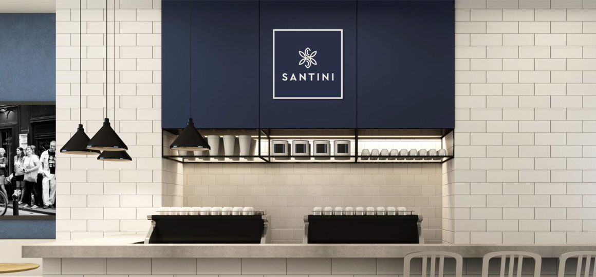
Santini
BrandingA brand’s name should tell a lot, if not everything, about a business. Santini, this business’s name, was chosen to represent versatility and inclusiveness. Let's see how!
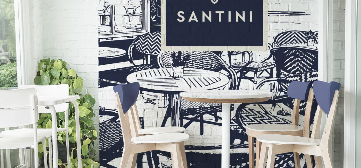
Santini is a pioneering family. It provides an unparalleled atmosphere and elevates the dining experience to the highest levels of comfort and enjoyment.
Along with live music and entertainment shows, Santini offers exquisite and multinational cuisine to satisfy all appetites.
Problem & Solve
The restaurant was planned to launch on competitive grounds. Big competitors are just one boulevard away! Thus, our client requested a catchy naming with a powerful visual appeal. That’s how the name Santini came into existence!
Santini is a Chrysanthemums followers. It’s special because it can be offered on any occasion. We chose the name as it personifies the restaurant’s service and philosophy: versatility and inclusion!
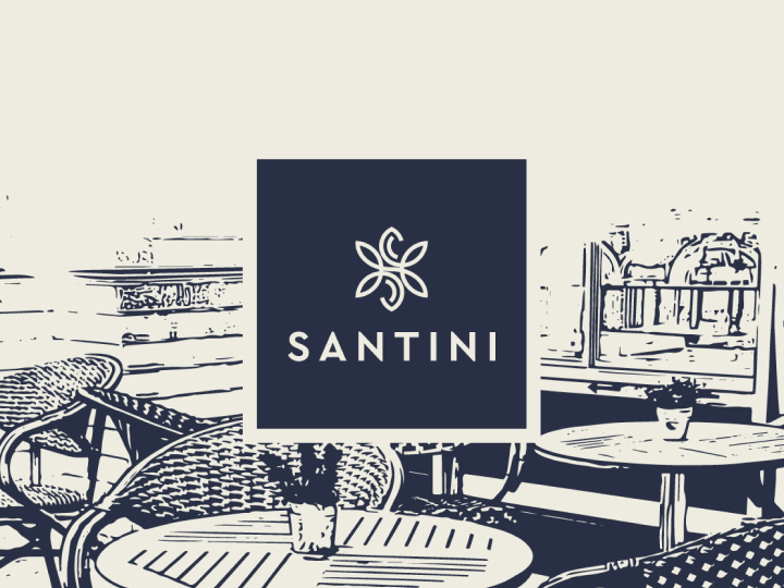


In terms of visual symbolism, we created a logo in the shape of a square with a favicon in its center. The shape represents the the restaurant’s territory in the real physical world.
The favicon was designed as a Santini flower with the letter S embedded within its petals. This helped cement the branding significance of the naming “Santini” with the visual symbol.

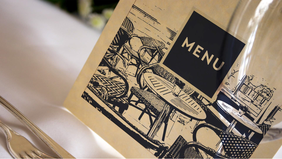
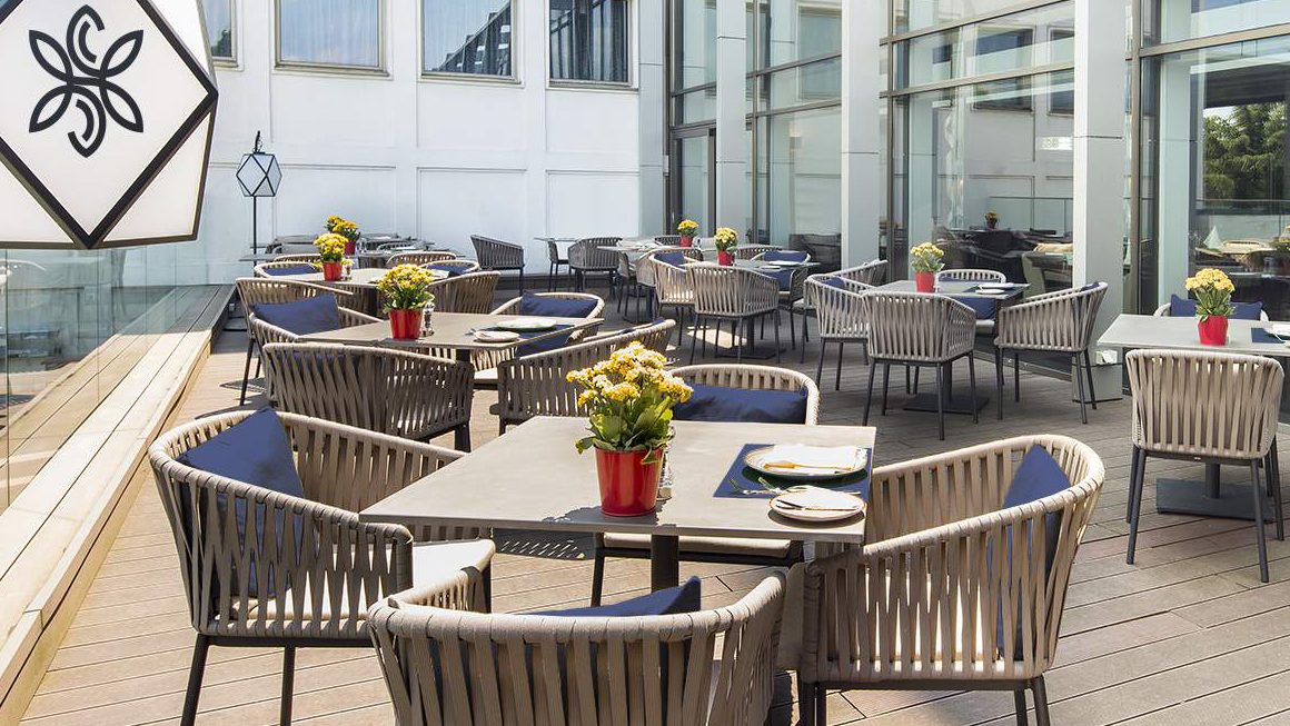
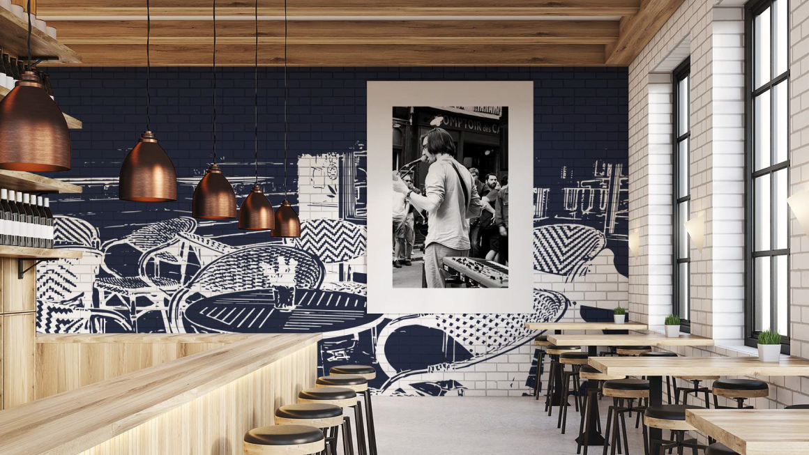
An eminent name and appealing visual brand can help businesses stand out and get attention, even in a bitterly competitive environment.
Santini took advantage of its great name and brand and delivered top-tier services to its customers. It now is one of the most renowned restaurants in its area!
