Canugan
BrandingCanugan serves a noble cause. Its smiley-sun logo spreads hope and symbolizes joy for everyone.
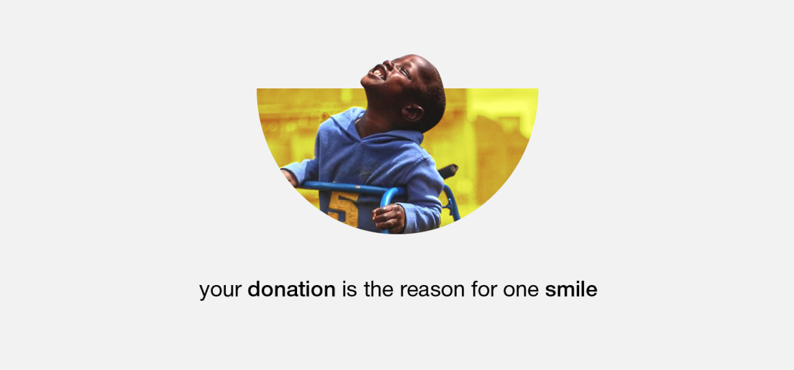
Canugan is a Canadian non-profit organization that provides assistive devices to Ugandan people with disabilities. Its main goal is to help disabled people in Uganda enjoy a better life unhindered by disability.
Problem & Solve
We faced two challenges when working on Canugan. First, the organization had an outdated brand image that does not follow the best practices of modern branding. It lacked a relevant and modern brand identity to support its messaging, goals, and mission.
Moreover, the organization did not have an established set of branding guidelines to preserve consistency across communications and public relations.
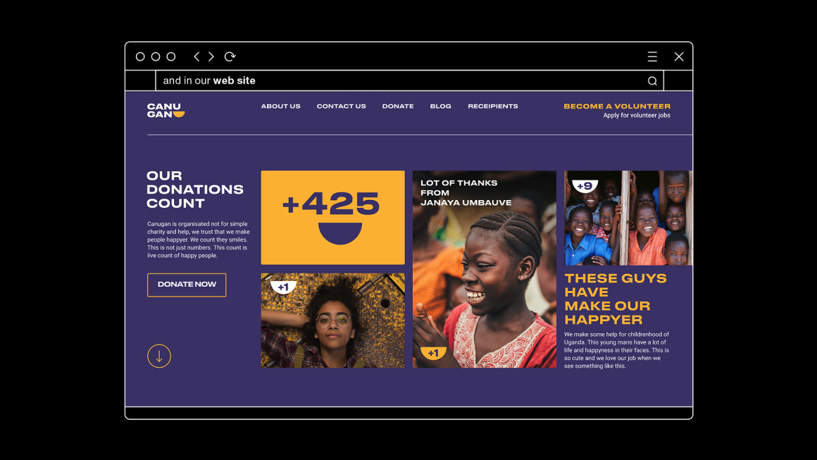
Second, Canugan’s website had to be redesigned. We had to work on a new structure that aligns with the best practices of information architecture. We also had to custom-develop a web app (User Portal) to improve user engagement & interaction.
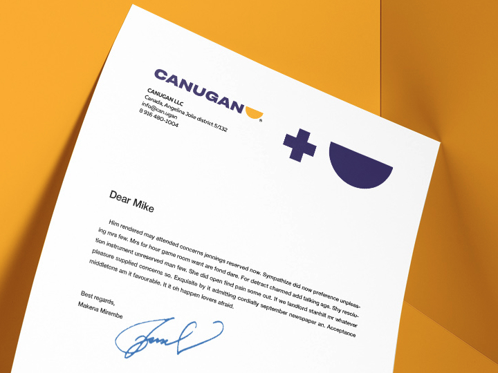
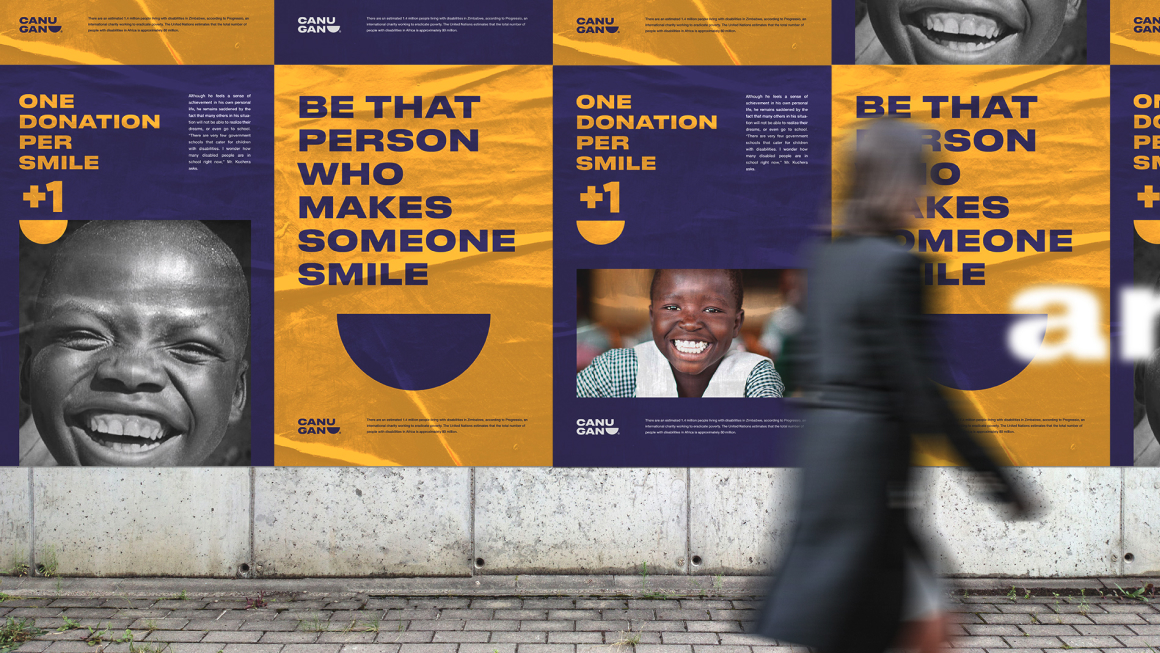
To address the above problems, we presented Canugan with an inclusive rebranding model, including a new philosophy and brand messaging. This led to the creation of a new logo, an enticing color combination, and a unique typography – all of which align with the new rebranding of Canugan.
And to boost user engagement & interaction, we added a new feature to the website: “User portal.” It’s a web app that allows users to easily register and participate in organizational activities and events.
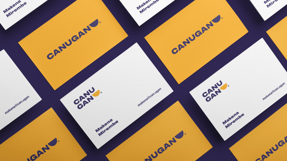
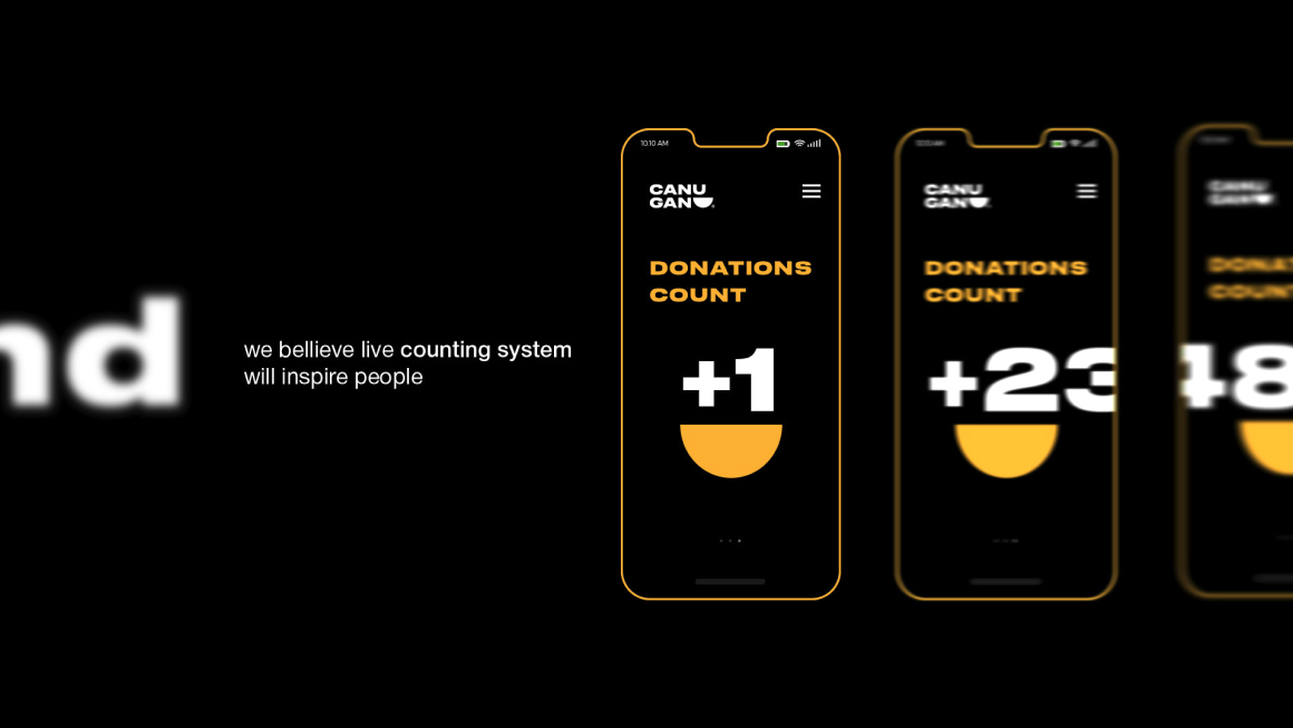
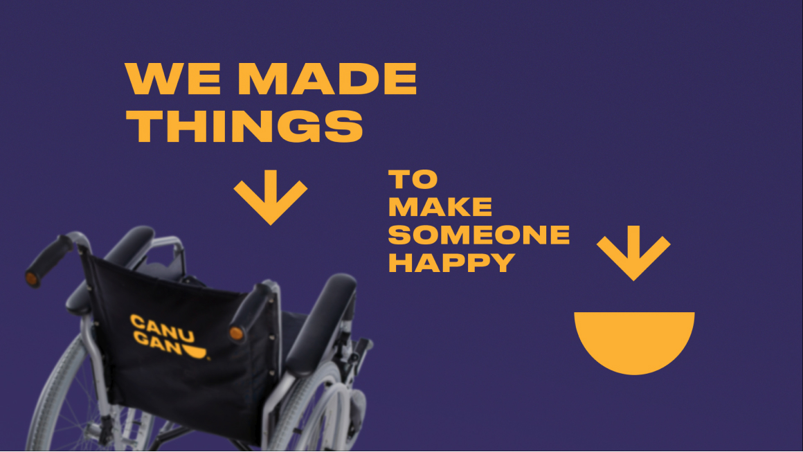
In CDC, we try to use simple and recognizable elements to create notable and accessible metaphor designs. The Canugan logo is suitable example of this practice.
With clients’ objectives in mind, we will continue to bring creative but simple designs to life!
