Picasso
BrandingThe name “Picasso” blends art with canned food distribution. It serves as a metaphor that likens food products and their packaging to the art pieces of the suburb artist Pablo Picasso.

Picasso is an FMCG company that specializes in canned food distribution. Their mission is all about distributing exclusive and high-quality food goods with a touch of artiness. They’re dedicated to provide fast distribution of premium products to customers with unique and artful packaging that gives food a fresh taste.
Problem & Solutions
Our client needed a name and package design. The challenge was to find a concept that reflects their brand’s message and stands out in the market.
To solve this, we proposed three brand names that correlate with their message: distributed food products aren’t merely consumable goods but works of art. As a result, Picasso emerged as a relevant brand name!


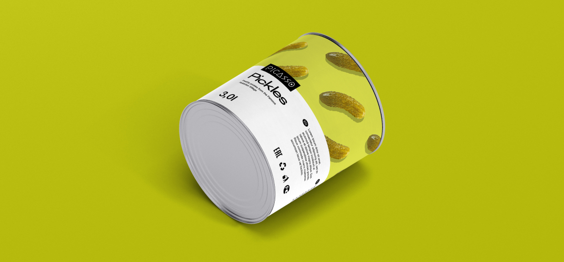
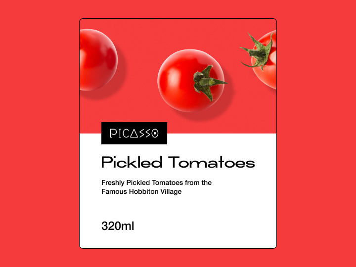
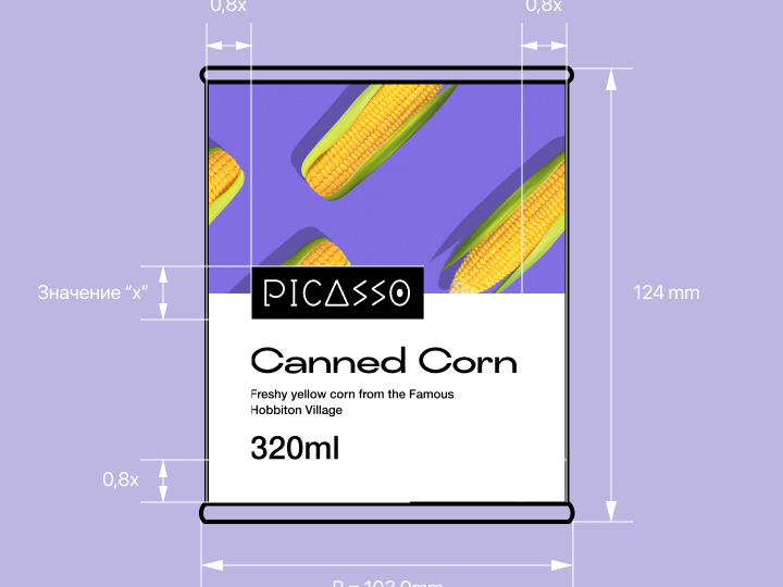
We had to craft a unique visual identity to be memorable and reproducible across all media and product package labels. Therefore, we created an original package design, composed of two elements.
The first element elegantly illustrates the content of the product. Whereas, the second element provides relevant product information like logo, ingredients, product name, and so on.


Picasso is now ready to join the market and focus on delivering quality food. Their brand identity is already established, and the eye-catching packaging will delight customers!
