Smart Clean
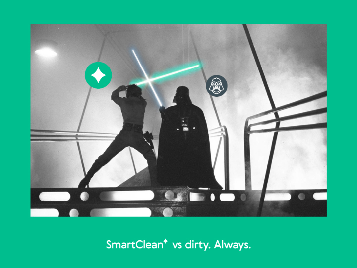
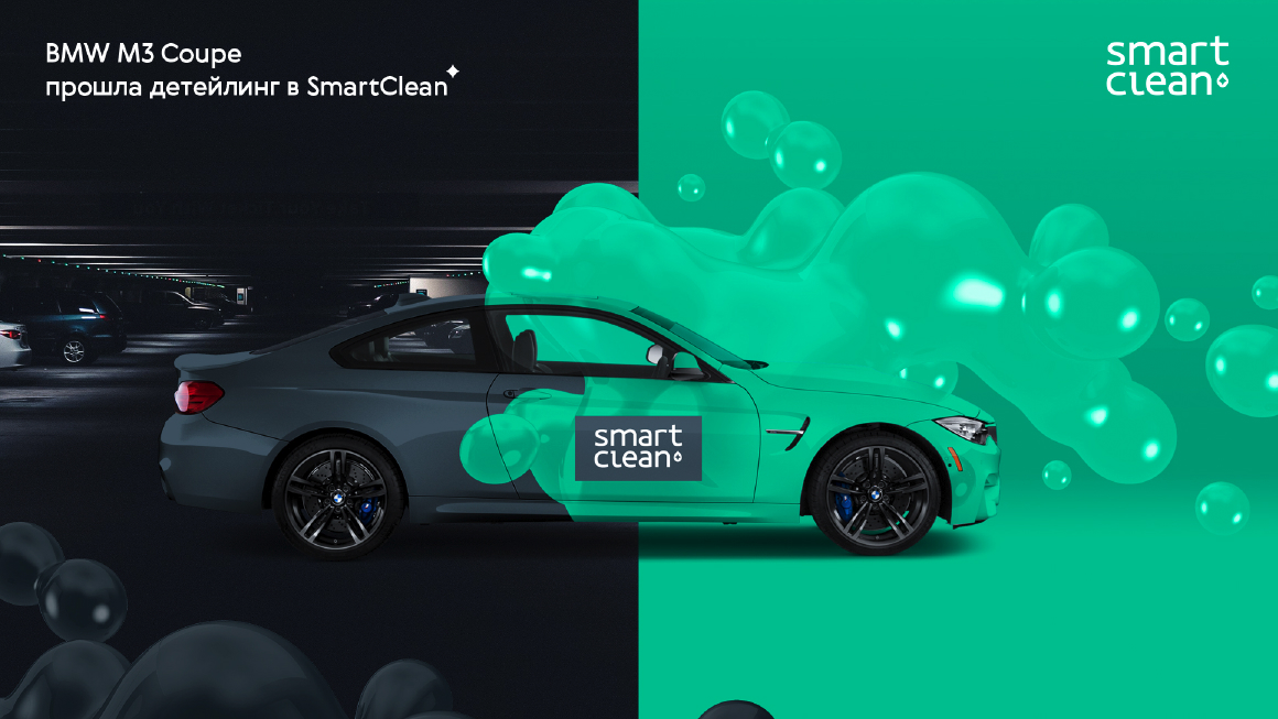
BrandingThere always are two dichotomies; black & white, good and evil... and Smart Clean & Dirty. This eternal struggle between two oppositions is what we leveraged in this project!
Smart Clean is a unique car wash facility. Unlike standard car wash services, Smart Clean has a futuristic system of operation. Smart Clean provides an exceptional queuing system that makes driving to a car wash effortless, timely, and convenient!
Problem & Solution
After integrating the navigation system into the car wash network, our client wanted to, further, improve the service by creating an application. The purpose of the app was to help customers book car wash appointments easily with minimum queuing time. This would allow drivers to reach a car wash and clean their cars quickly without wasting time.
We encountered two main problems in this regard. First, we had to create a visual brand that looked great, even in dirty places like a car wash. Second, we had limitations on color schemes as not all colors would look good, again, in a dirty environment!
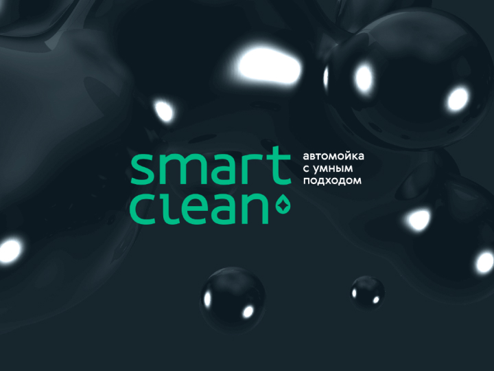
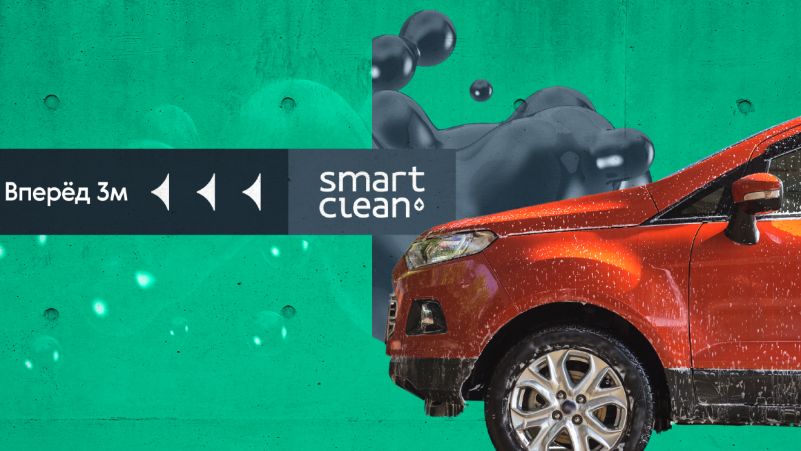
We tested more than a color scheme! Finally, we chose to work with the colors you see in this gallery. The colors are easily reproducible on surfaces and are low-maintenance in dirty spaces like a car wash. We’ve alos used the Smart Clean name in the logo, as it has a good resonance & is memeroable.
Building on that, the branding phrase “Smart Clean vs. Dirt” was created.
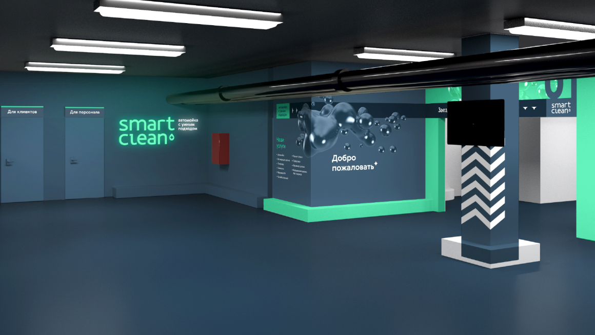
The entrance & the guide are tainted in the brand’s jade color, while the other insignificant facilities are tainted greay-blue, representing the before-cleaning phase; With the branding motto in mind, the struggle between Smart Clean vs Dirt was perfectly implied in those colors!


Branding is a marketing pillar. It is, and it should be, pragmatic and beneficial. At CDC, we don’t choose color schemes and designs just becuase they’ll look beautiful. We run the extra mile and try to come up with designs and suitable color schemes that will function well in the market & still be easily reproducible.
