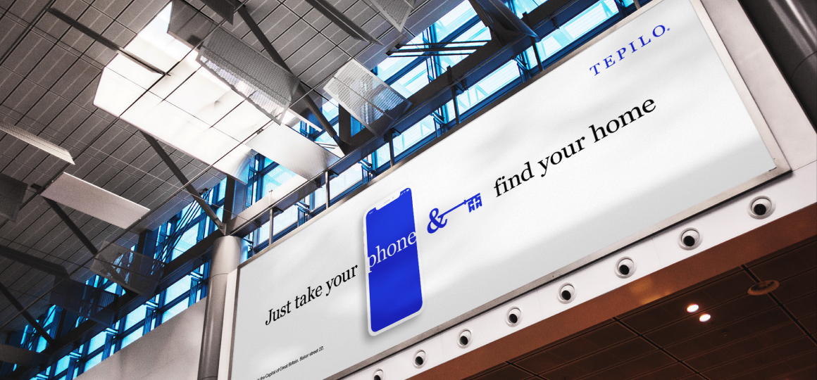
Tepilo
BrandingWhen done properly, conjoining two or more distinct elements can result in creative, catchy, and aesthetically appealing designs. That's what we did with Tepilo!
Tepilo is an online real estate market place that provides a mutual service to both: property owners and properties hunters. This allows real estate owners to locate potential prospects easily, and at the same time, it helps people find, buy, or rent properties straightforwardly!
Problem & Solution
We needed to create an indigenous and eminent brand image that visually fits the real estate segment at Tepilo. We also had to ensure the visual branding would serve the promotional strategies and activities of the company.
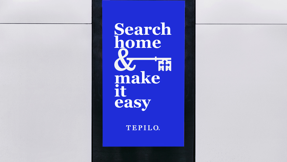
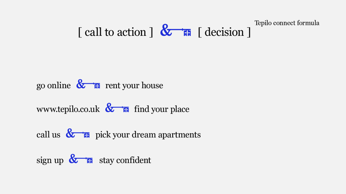
So, we came up with a unique branding concept that corresponded with the real estate segment and the mission of Tepilo. The concept was in the form of a favicon that consisted of two connected visual components: an ampersand symbol (&) and a house key.

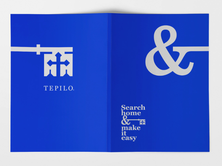
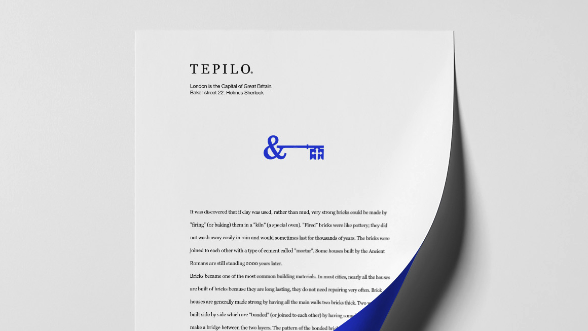
The favicon, finally, has become a token that represents the brand as a bond that connects property owners to potential prospects, and vice versa.
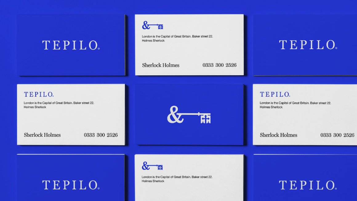
CDC believes visual branding to be more than just abstract and artsy elements. To us, it’s also a pragmatic component that should emphasize your brand through Minimal Viable Components.
That’s what we created for our client, Tepilo. We delivreed the goods in the required formats & offered a free presentation of advertorial slogans for the brand!
